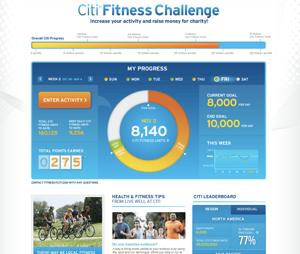
I redesigned the PCH.com homepage, a platform used by millions of people every day. The old site felt cluttered and inconsistent. My goal was to clean up the visual hierarchy, unify the brand, and make it work for every age group.


Challenge

Process
Strategy
Cut the noise. I stripped away anything that didn't support a core action and rebuilt the layout on a simple, scannable grid.
Built one component system. Cards, buttons, and modules follow the same rules everywhere, so new pages stay consistent without extra design work.
Designed for everyone first. High-contrast colors, bigger touch targets, and a type scale that holds up across devices and ages. Not an accessibility add-on, but the starting point.
Solutions
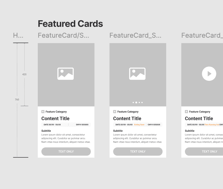
One card, four systems. I built a Feature Card as the base, then adapted it for List, Grid, and Carousel use. Same visual language, ready to drop into any layout.
Mobile first, backed by data. Mobile traffic kept climbing, so I designed the mobile experience first and scaled up to desktop, not the other way around.
One image size, not ten. Every business line was making its own image sizes for the same recurring content, and designers kept remaking the same assets over and over. Standardizing to one ratio cut that repeat work down to a single image.
Tested, then simplified. I tried icon-based buttons and color-coded states by business line, but kept the homepage to one brand color, orange, to stay consistent. Colors that failed WCAG contrast got retuned brighter until they passed.
Outcome & Reflection
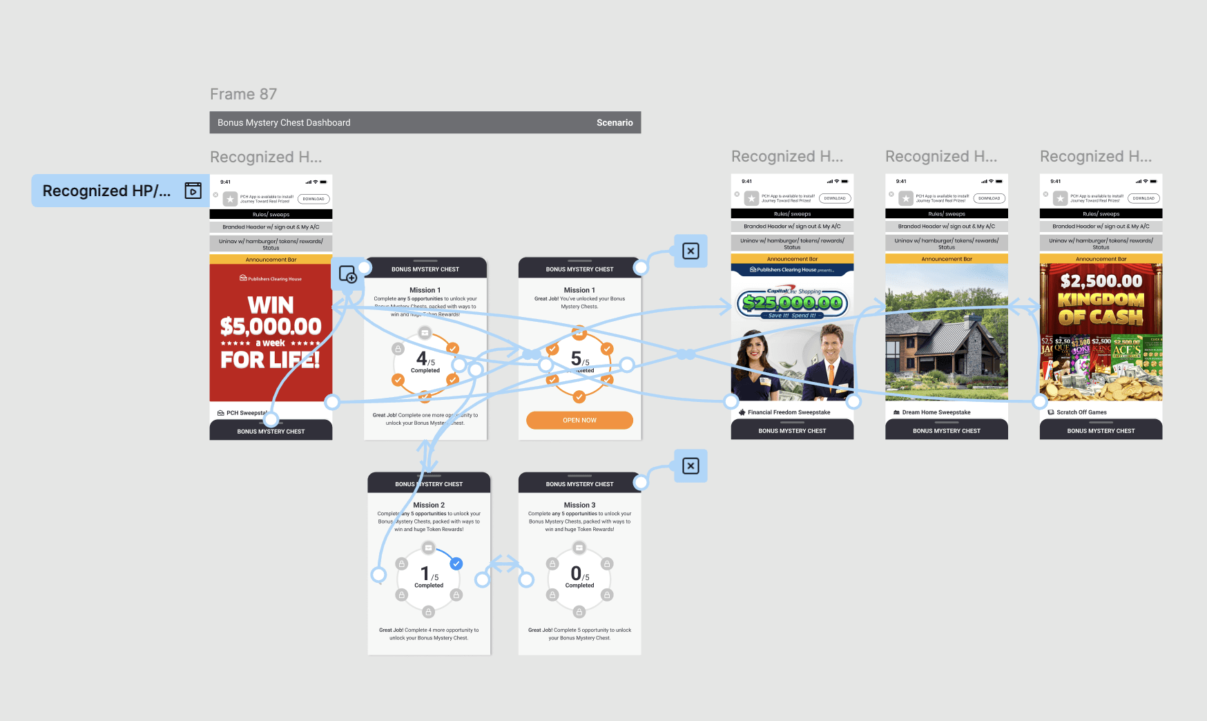
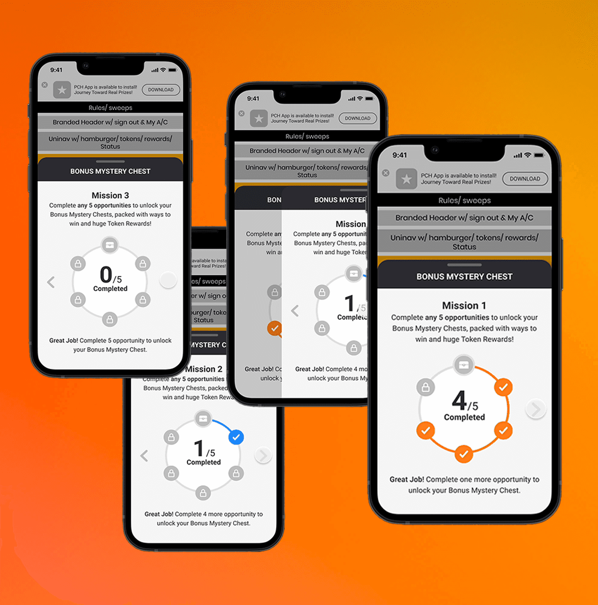
A shift in business priorities put the launch on hold. The redesign itself never shipped, but the work was complete: every screen built, every component tested, and the system fully ready to go.
What I'd carry forward. Two years of iterating as a team taught me that a design system built to scale outlasts any single launch date. This one is still ready to ship the moment priorities shift back.